
SAMPLES OF OUR WORKS
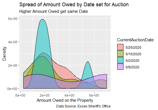
Uncovering Evidence of Profiling in Foreclosure Data
To the left is a graph that depicts foreclosure data in Essex County NJ. The graph shows that the sheriff's sale date for the highest foreclosure offset amount owned by the property owners are the same. It may be evidence that the Sheriff's Office has to gain in scheduling higher offset amount owed on the properties on the same date or it may be just a coincidence.
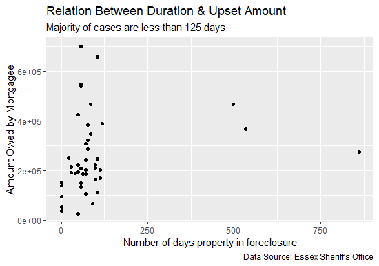
Uncovering Evidence of Collusion in Foreclosure Data
The graph on the left shows that: first, most foreclosure cases are in the Courts 125 days or less whether the property owners settles or the property is foreclosed on. This is circumstantial evidence that there may be a concerted effort to get cases settled within 125 days or less and also that foreclosure resolutions in low income areas occur at a faster rate than in high income areas.
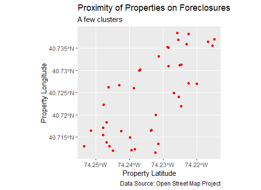
Uncovering Evidence of Profiling in Foreclosure Data
There seems to be no correlation or very little if one looks at current properties on foreclosure proceedings from a geographic and location bird's eye view. But we went further. By feeding the data to a clustering ML algorithm such as K-means we uncover that there no outliers and that properties below latitude 74.25 face greater risk of foreclosure than those above.
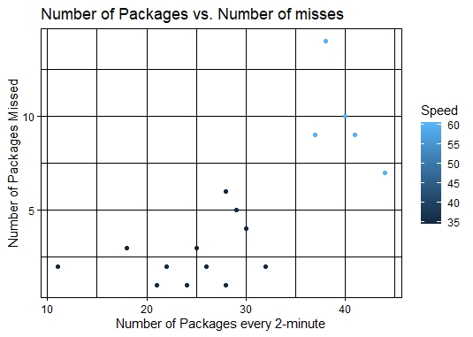
ANALYZING FedEX J Belt Operation
To the right is a pictorial presentation of J Belt Manual Sort Inside a FedEX Hub
At FedEx packages that are too heavy and too bulky are sorted manually by workers loading them at the green-painted section of the J-Belt and by unloaders manually and visually inspect them and picking them up off of the J-Belt at the brownish-pink section of the J-Belt. Since a number of packages end up at the end of the J-Belt and no picked up, our job was to find out which factors drive the inefficient operation of this J-Belt
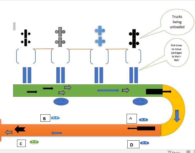
ANALYZING FedEX J Belt Operation
The Graph shows the correlation between volume and number of packages missed by unloaders
To conduct our analysis, relevant data was collected by observing the operation of the J-Belt during a normal shift. Several variables were noted such as: speed of the J-Belt, the volume, and number of packages missed every 2-minute increments. Our analysis found out that the driving factors of an inefficient belt operation in order of importance are: speed of the J-Belt, volume, skills of the unloaders (not noted in the graph).
OPEN SOURCE CODES WRITTEN IN R
To the right is the open source codes written in R version 3.6.2 that generated the analyses and graphs above.
Author: Rubens Titus
########################
#The following codes are written to analyze the dataset of 'current'
#listing of foreclosures in the City of Irvington NJ by plotting certain
#variables against one another and picking up the trend or a pattern
#and by summarizing existing variables to find out the dominant pattern in
#the dataset
#*******************
# Loading needed packages
# install.packages("tmaptools")
# install.packages("stringr") for string manipulations
library(tidyverse) # load tidyverse package
library(lubridate) # to transform dates to a format R understands
library(tmaptools) # to be able to query and retrieve mapping locations from OSM
#**************************
#Working Directory Set to /Final
setwd("~/SETON_HALL_UNIVERSITY/SPRING_2020/PSMA6002_RESEARCH_METHODS/Final")
#****************************
# Loading the datasets into R (RAM) - primary and secondary tables
#****************************
Essex_Main <- as_tibble(read.csv("all_essex_5-8-2020.csv", sep = ",", header = TRUE, stringsAsFactors = FALSE))
Irvington_Details <- as_tibble(read.csv("irvington_case_details.txt", sep = ",", header = TRUE, stringsAsFactors = FALSE))
view(Essex_Main) # to verify the integrity of the dataset
view(Irvington_Details) # to verify the integrity of the dataset
# Tidying Up the datasets
# Standardize dates format to R format
Irvington_Details$OriginalAuctionDate <- format(as.Date(Irvington_Details$OriginalAuctionDate, format = "%m/%d/%Y"), "%Y-%m-%d")
view(Irvington_Details) # checking integrity
Irvington_Details$CurrentAuctionDate <- format(as.Date(Irvington_Details$CurrentAuctionDate, format = "%m/%d/%Y"), "%Y-%m-%d")
view(Irvington_Details) # checking integrity
str_length(Essex_Main$Plaintiff[2])
# Producing the Graphs
#**************************
# Graph_1
ggplot(data = Irvington_Details) + aes(x = AmountOwed, fill = CurrentAuctionDate) + geom_density(alpha = 0.5) +
#labs(title = "Distribution of Stated Amount Owed")
labs(x = "Amount Owed on the Property",
y = "Density",
title = "Spread of Amount Owed by Date set for Auction",
subtitle = "Higher Amount Owed get same Date",
caption = "Data Source: Essex Sheriff's Office")
# Graph_2
#**************************
# Creating time interval for each entry then calculating the number of days on foreclosure on the fly
# and plotting it against the amount owed.
TimeOnForeclosure <- interval(Irvington_Details$OriginalAuctionDate, Irvington_Details$CurrentAuctionDate)
ggplot(data = Irvington_Details) +
geom_point(mapping = aes(x = TimeOnForeclosure / ddays(1), y = AmountOwed)) +
labs(x = "Number of days property in foreclosure",
y = "Amount Owed by Mortgagee",
title = "Relation Between Duration & Upset Amount",
subtitle = "Majority of cases are less than 125 days",
caption = "Data Source: Essex Sheriff's Office",
color = "CurrentAuctionDate")
# Graph_3
#**************************
# Joining the secondary table with the primary and filter in properties
# that are only in Irvington by SheriffCaseNumber.
# Since the PropertyAddress is already correct we use geocode_OSM function to
# get the latitute and longitude of each property address querying OpenStreetMap
# A few addresses got cut out due to typos
Irvington_Address <- left_join(Irvington_Details, Essex_Main, by = "SheriffCaseNumber", copy = FALSE)
Irvington_Address %>%
mutate(OriginalAuctionDate = as.Date(OriginalAuctionDate),
CurrentAuctionDate.x = as.Date(CurrentAuctionDate.x),
AmountOwed = as.double(AmountOwed))
view(Irvington_Address)
Irvington_geocode <- geocode_OSM(Irvington_Address$PropertyAddress, as.sf = TRUE)
ggplot(data = Irvington_geocode) +
geom_sf(color = "red") +
labs(x = "Property Latitude",
y = "Property Longitude",
title = "Proximity of Properties in Foreclosures",
subtitle = "A few clusters",
caption = "Data Source: Open Street Map Project")
# Thank you.
# Calculating what percentage of mortgage owned by each lender
# Irvington_Address_test <- as.tibble(str_split(Irvington_Address$Plaintiff, ",", n=2, simplify = TRUE))
IrvingtonAdrMortRootName <- Irvington_Address %>% separate(Plaintiff, c("Plaintiff_clean", "Extra"), ",", extra = "drop")
view(IrvingtonAdrMortRootName)
#make sure the columns get real names before proceeding
IrvingtonMortgagorsGrouped <- (IrvingtonAdrMortRootName %>% count(Plaintiff_clean))
view(IrvingtonMortgagorsGrouped